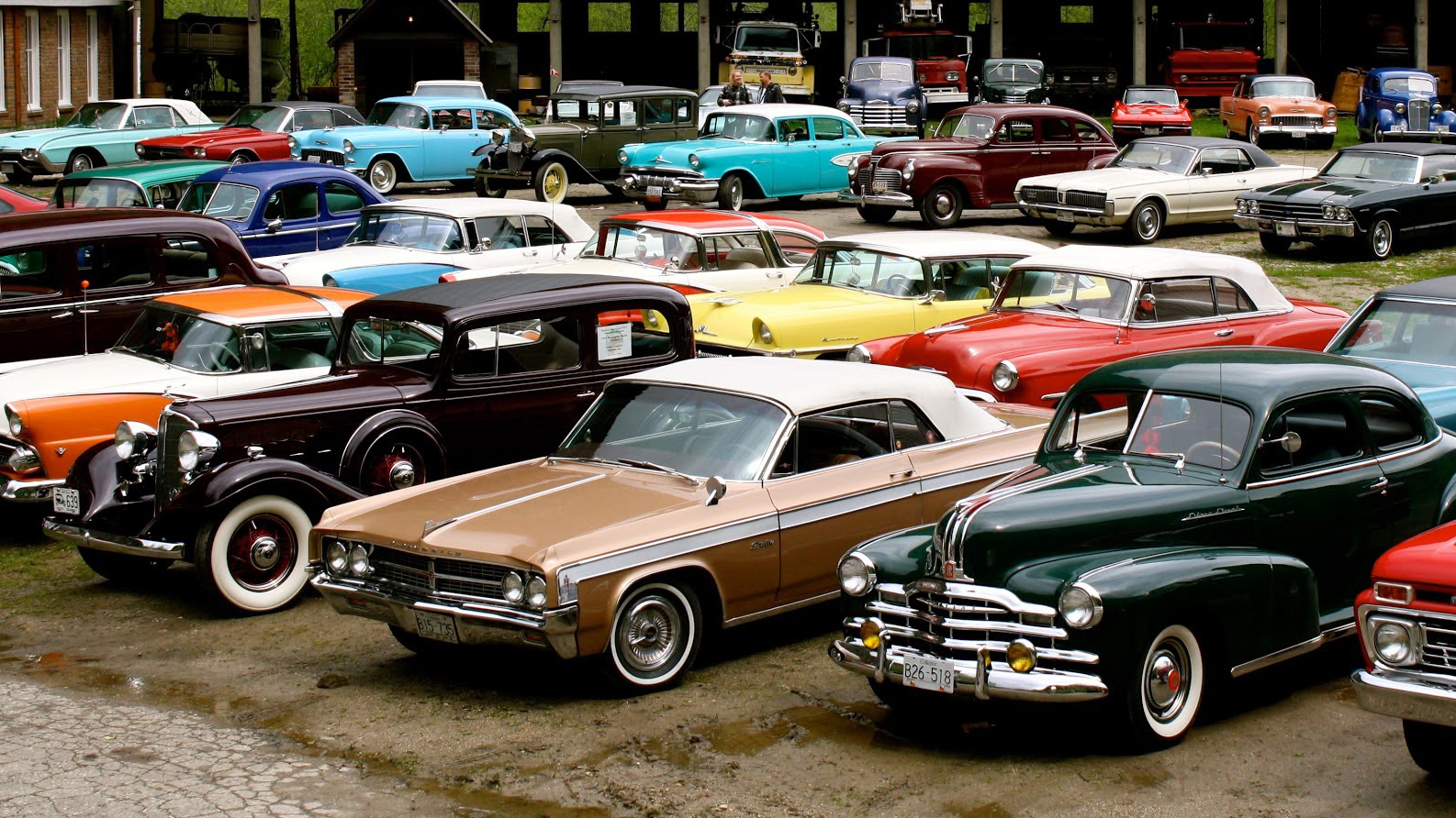
Gone are the days of styling when the make and/or model of a car could be easily identified across a crowded parking lot. Take for instance, one of the most cherished designs in the heyday of automobiles, the 1957 Chevrolet Bel-Air Convertible, aka “the ‘57 chevy.”
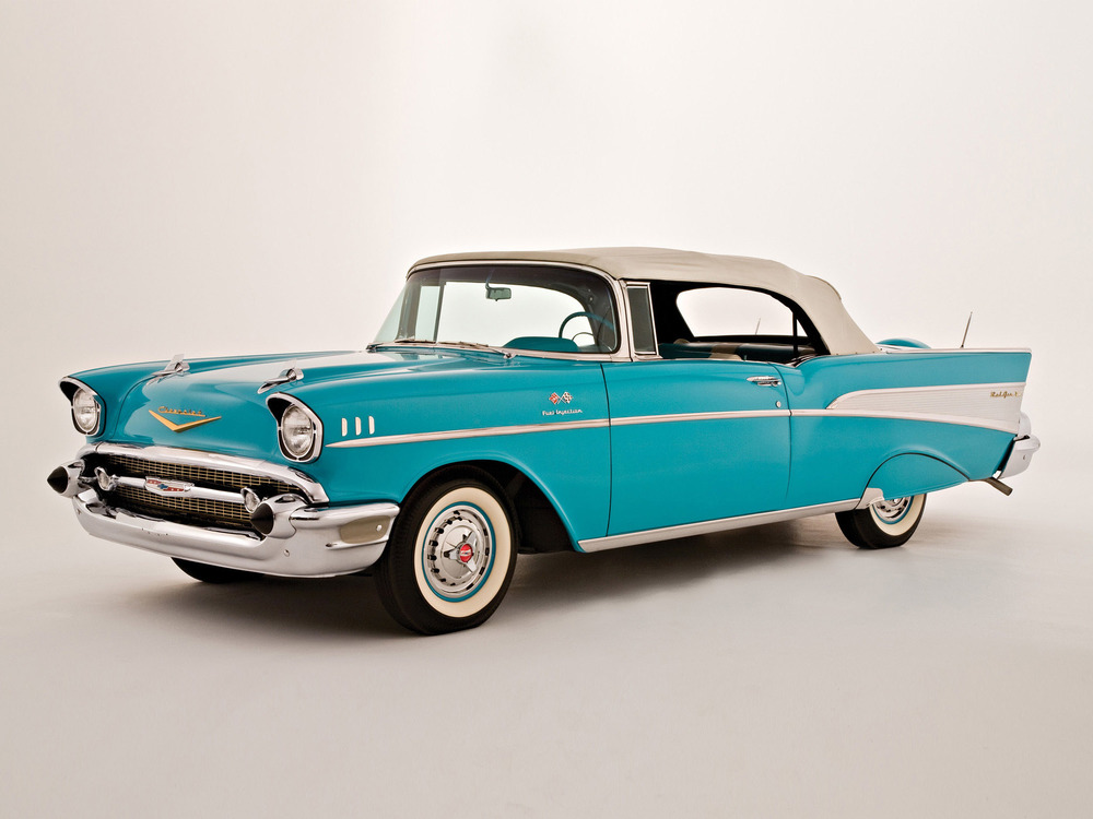
The ‘57 Chevy outside of being an icon, is one of those all-inclusive designs. From the appropriately placed chrome accents, swooping headlights, two-tone paint, and moderately sized rear fenders – this car had it all. Back then cars were distinctive inside as well as out.
It was attractive, plush, came in different variations, and it was highly sought after then (and still is today).
Tune in everywhere you stream, download or listen!
Even the Europeans – well, mostly the Italians – had a real flair for design, with some absolutely gorgeous cars.
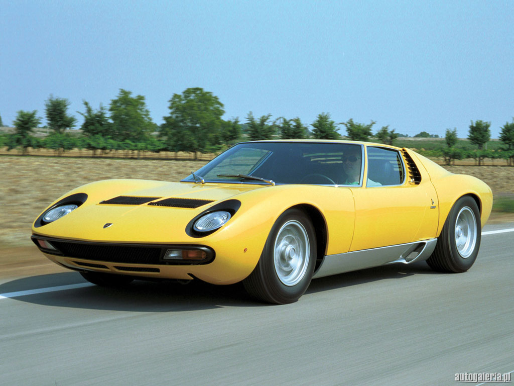
Take for instance, one of the most beautiful works of art – at least in my opinion – to come out of Europe, the 1967 Lamborghini Miura. It’s one of those cars that doesn’t need to be explained, it has a universal gut reaction of “wow.”
Tune in everywhere you stream, download or listen!
The Germans were never known for being overly flamboyant
Tune in everywhere you stream, download or listen!
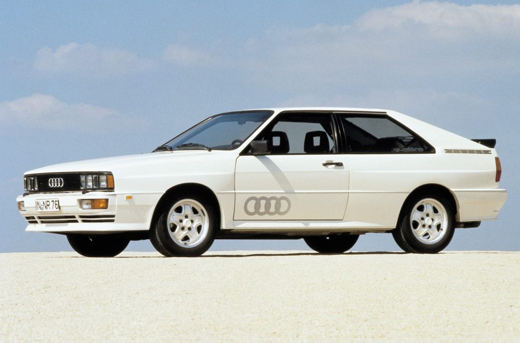
But some of their designs did set the bar in various design vertices. Outside of the constantly evolving 911, one such design: the Audi Quattro when it debuted at Geneva in 1980 changed the way we looked at complex mechanics in a small package. Not to mention, it started the whole boxy car + knife-edge flare craze that many manufacturers copied throughout the late ‘80s and ‘90s.
In Japan however, designers were never much for creating something new, but they were excellent at taking an existing design and improving on it.
Cars like the 1967 Toyota 2000 GT derived its inspiration from the Jaguar E-Type. The Datsun 510 and the original Nissan GT-R were loose copies of a FIAT. And one of my favorites, Mazda – who was taken to court by Porsche for too closely mimicking the design of the 944 turbo when the 2nd Generation RX-7 debuted. I digress, but I will give them credit – Japanese designers really loved those fender mounted side mirrors! Do a quick search on “iconic Japanese vehicles” and you’ll note many of them include this design feature. (Even if they are a carry over from british roadsters).
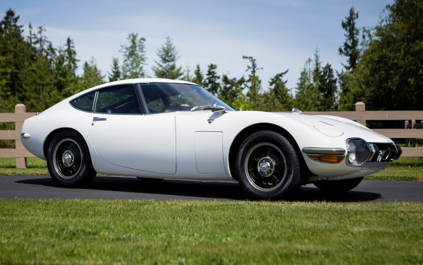
But why can’t we have cars that “look” like the ‘57 Chevy, the Miura, and others from the past?
Why do they all have to look like mobius blobs of metal? By comparison, todays cars all look like something that would have only been imagined for Blade Runner or Total Recall but in a nutshell, automotive styling has been overshadowed by a need for fuel efficiency. Since only one shape cheats the wind, automotive style has started leaning towards “that shape” which can be easily described as teardrop or pill shaped. This doesn’t mean that styling is completely dead, just much more muted than before. But how did we get from the swooping fenders, poodle skirts and the “new for the 19xx model year” designs to today?
The ‘70s gas crisis changed everything
It was the first step in the wrong direction. Instead of lightening the vehicles and making the engines more efficient, engineers opted to scrap their Mustangs, Challengers and Firebirds for something smaller. For decades, the American Big-3 were notorious for “badge engineering” a concept that spanned from their sub-compacts all the way to their full-sized luxo-barges.
Tune in everywhere you stream, download or listen!
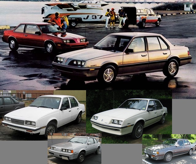
Perhaps the worst example of badge engineering comes from the General Motors “Model J” series (seen above) in 4-door sedan trim, these were all the EXACT SAME CAR with different branding bits. Because these were all based on the same chassis, the visible differences between the cars were minimal with only slight differences being such styling cues as front clip (headlamps, grille and bumper) and tail lamps. Despite these cars being total rubbish, there was something important going on, the idea of “Platform Sharing” had started to emerge, a concept that is being touted today as “new and innovative cost saving measures” on the part of automobile manufacturers.
As mentioned in a previous article, a lot of the cars from this period were heinous, terrible places to live. Not many people recount the glory days of driving around in their Skyhawk (despite the name sounding really cool). And as a note, compared to the rest, the Cimarron (being a Cadillac) wasn’t much of a step up, using low-grade leather to cover the seats at a time when only “luxury” cars had this offering. But more importantly, devolving from these trend setters came all the econo-boxes of the late ‘70s and early ‘80s.
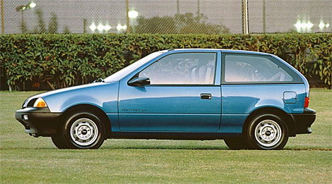
“Cab-forward” and how the ‘90s ruined cars forever.
Chrysler’s marketing department coined the term “cab-forward,” and it has been used by journalists to describe the styling of ‘90s-era cars ever since. The idea was to take the entire interior cabin of a vehicle and move it forward — extending the windshield over the front wheels. The result is an interior that can be “stretched” to provide more space. At the same time, the rear wheels move closer to the rear of the vehicle. This reduces body overhang and provides a longer wheelbase for better ride and handling, as well as a more stable vehicle platform, all within the same, or even shorter overall length. Do you remember the Pontiac ads from the ‘90s? Many ads read: “wider is better.”
Tune in everywhere you stream, download or listen!
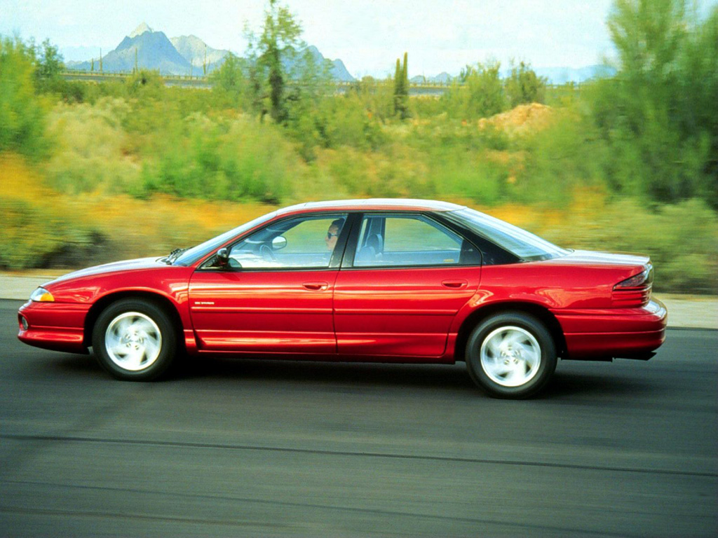
Once the design engineers had figured out how to make more “people space” in a modern vehicle the safety engineers got involved developing a new concept called “crumple zones” along with “airbags.” All of this new safety gear required space, space that a cab-forward design could now afford the engineers.
By now, we take for granted what airbags are and what they are for, but many might not know that crumple zones are areas of a vehicle that are designed to deform and crumple (crush) in a collision. These areas are engineered to absorb some of the energy of the impact, preventing it from being transmitted to the occupants. It all makes perfectly good sense: more people space = more people protection needed. With ‘90s prototypes completed, the Sales and Marketing teams got involved. These ideas of cab-forward and crumple zones now became key differentiators for this new era of car. “Safe” and “Space” were now buzzwords. First to market is always important. Ever wonder why so many people still categorize Volvo as “the safest car on the road”? — it’s because marketing did their job.
As a technical aside: Audi was one of the last European manufacturers to employ airbags in their cars, mainly due to the high reliability and cost-effectiveness of the technology they trademarked as “procon-ten”. The procon-ten system used thick winch-like cables linked to the rear of the engine, and in-turn connected to the steering column and seat-belt mounts. In the event of a frontal impact, the force and momentum would shift the engine rearwards, tensioning and therefore “pulling” the cables. When the cables were taught they would pull the steering wheel towards the front of the car, clear of the driver, and also remove any slack in the seat belts, holding the occupants more firmly in their seats until the accident had finished. Since no other manufacturer adopted Procon-ten it was eventually discontinued in the middle part of the ‘90s.
Meanwhile… as American consumers grew more sophisticated, their tastes became increasingly less enamored with badge engineering, which ultimately lead to the demise of Pontiac, Oldsmobile, Mercury, and Plymouth – to name a few. While this has created fewer offerings, this has also created some new and interesting partnerships between previously rival automakers. All the while, the continued need for greater fuel efficiency thanks to new government regulations loomed overhead.
The Japanese approached all of this quite differently, knowing that the American market wouldn’t support premium products from an established value line. (Two examples of such failures were the Subaru SVX and the Volkswagen Phaeton – both were premium models that were often double the cost of the cheapest models). Customers interested in premium cars simply didn’t visit those dealerships and customers who were interested in inexpensive cars weren’t willing to pay twice as much for a car that they weren’t interested in purchasing. And to the point, this is why Acura, Lexus and Infiniti exist.
But how did all of this affect today’s styling?
Quite significantly. Manufacturers scrambled to provide their customers with a premium look and feel all the while packaging the latest safety equipment and technology into their vehicles while focusing on creating a corporate appearance. This had happened in the past but with fewer models in their portfolios, the focus was more concentrated. This styling approach allows the compact model to look very similar to the mid or full-sized model (and often share parts, molds, etc) so that a buyer of the least expensive model wasn’t as easily identified. An obvious example is evident in the current Ford product line with the Fiesta and Focus being very similarly styled and while the Fiesta is smaller, it isn’t appreciably smaller, making it difficult to spot.
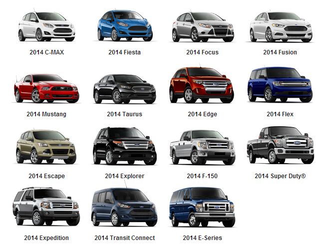
Throughout product lines, the distinction between Economy and Luxury has been blurred as well. Car models used to be a Base model and a Deluxe model but in the modern market, there may be 2 or 3 models (packages) in between. Look at the venerable Ford F-150 that offers the XL as a Base model and the Platinum as the Deluxe model. In the past, Ford offered a Base (no designation), an XL, an XLT and the Ranger. Granted, trucks are a bit different from automobiles but the Base was the contractor-grade with zero options, the XL and XLT had a few more creature comforts and the Ranger was equipped like a base automobile. In today’s market, the XL is fairly bare-bones with a washable interior while the Platinum rivals today’s luxury cars.
Another factor that has hurt automotive styling is the willingness of manufacturers to copy each other’s designs to capture sales. Two examples of this are the original Hyundai Azera and the Lexus LS. Both of these cars were directly aimed at the class-leader: the Honda Accord and the Mercedes E-Class, respectively. From a distance, the cars looked virtually identical from the body shape to the grill and light designs, down to the shape and placement of the various badges as well as being offered in nearly the same color schemes. This provided a tremendous value benefit to Hyundai and Lexus because their owners no longer were seen as driving a bargain replacement because the appearance was so similar that most motorists were unable to tell the difference.
Fortunately though, not every manufacturer has fallen into the generic automotive design trap. Fiat/Chrysler (FCA) has maintained some bit of individualism with it’s gigantic muscle cars and SUVs, Ford with their Performance Line (Mustang, GT and ST/RS) and Chevrolet with the Corvette and Camaro. Unfortunately, the European and Asian automakers are producing blobs that all look frighteningly similar.
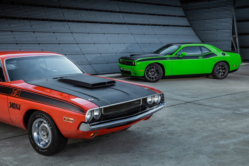
In the end, much of the “lack of design” in automobiles in today’s era is summarized by the need for better aerodynamics, safety and fuel efficiency. However there are also fewer unique cars on today’s roads due to the cost benefit of technology and platform sharing. But if we can learn anything from Chrysler – who as we’ve seen – has been on both sides of this design pendulum, maybe the engineers can find a way to bring back popular designs and update them to today’s standards. But for now, we’ll call it a study in aerodynamics… #whatsoldisnewagain.
Until next time, thanks for reading.
– Matthew –


